Web design
FINOCONTROL WEBSITE
FINOCONTROL WEBSITE
A complete end-to-end website design for a FinTech education platform turning finance enthusiasts into industry-ready professionals.
A complete end-to-end website design for a FinTech education platform turning finance enthusiasts into industry-ready professionals.
Year
2025
Year
2025
Year
2025
Industry
Finance Consultancy
Industry
Finance Consultancy
Industry
Finance Consultancy
Intro
Finocontrol had the product, the credibility, and the track record, but their website wasn't telling any of it. The old site failed to communicate what they actually do, who it's for, and why it matters. Users landed and left confused.
I took it from scratch. Full end-to-end UI/UX design from information architecture to final screens built to clearly position Finocontrol as Asia's leading FinTech education platform. Every section was designed to do a job: convert visitors into enrolled professionals.
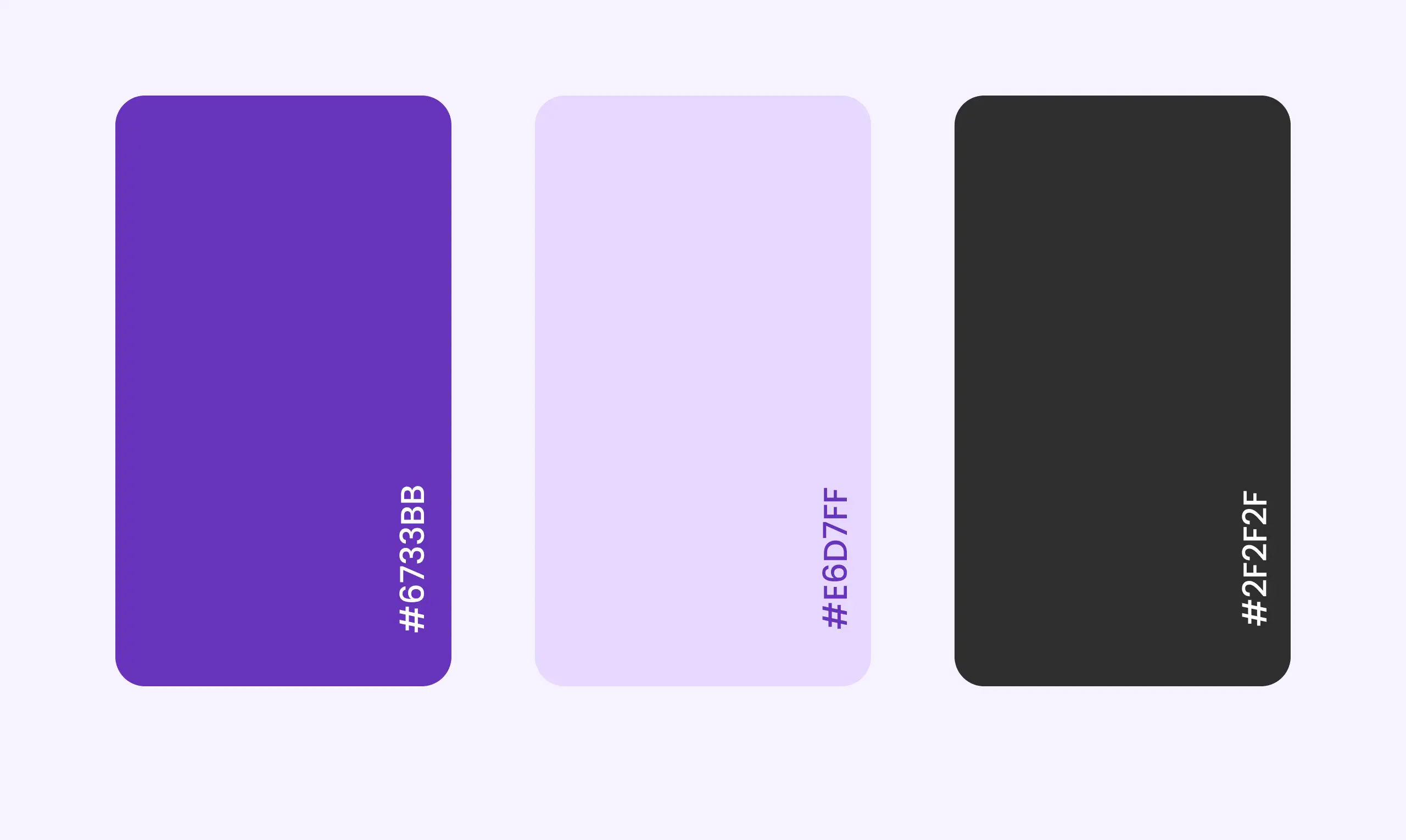
Style Guide
Final Design
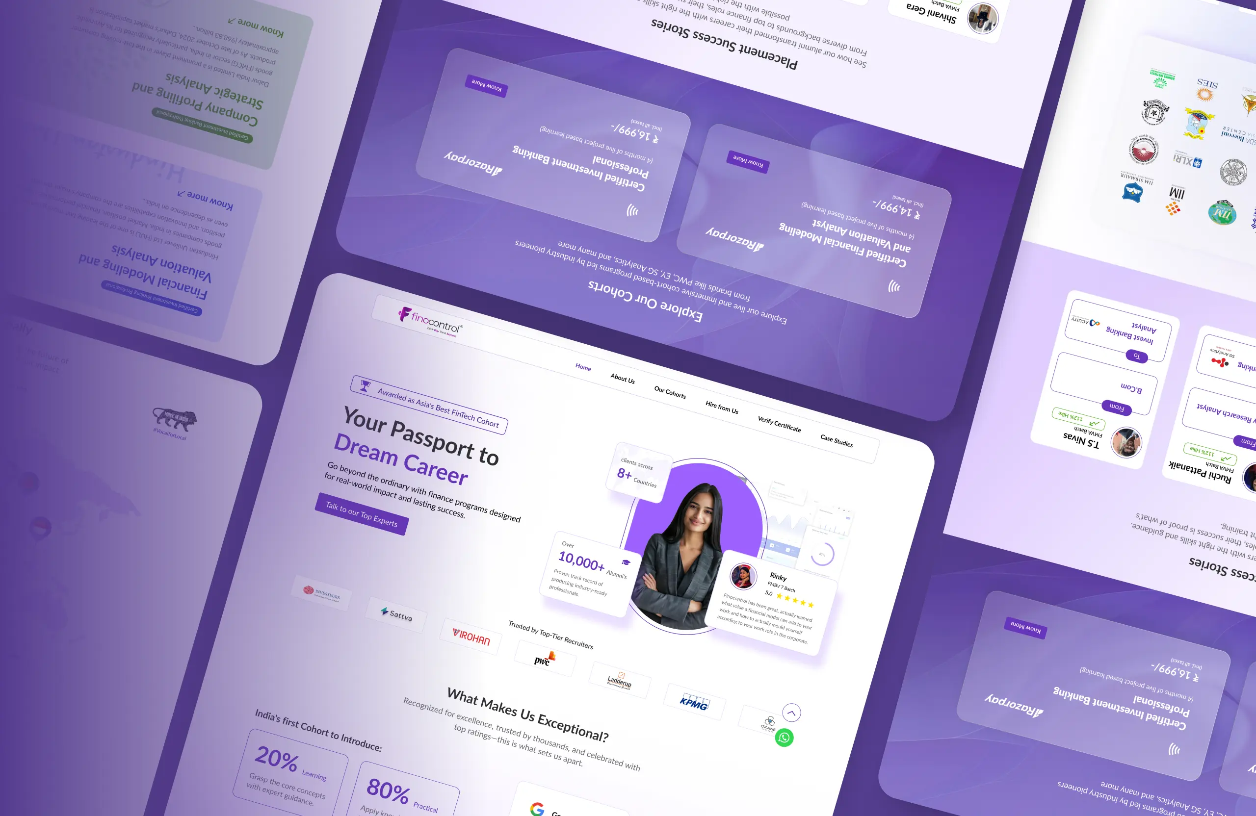
Every screen built with one goal make it clear, make it trustworthy, and make it work for everyone. Here's the end result.
Trust was the foundation of every design decision. In the hero section alone, three elements work together to build it instantly real testimonials from real students, the "Asia's Best FinTech Cohort" award, and company logos where alumni now work. Together, they answer the three questions every visitor has: can I trust this platform, is this the right place to learn, and will it actually get me results. This same approach layering credibility signals into every section runs through the entire website.
Intro
Lato was the clear choice for Finocontrol. Clean, highly readable, and professional without feeling cold it handles dense content like course details, milestones, and program information without ever feeling heavy. It scales well across all screen sizes and performs consistently on low-spec devices, which was a hard requirement for this project. Functional, human, and built for clarity.
Intro
The redesigned Finocontrol website launched as a complete shift from what existed before a platform that now clearly communicates who they are, what they offer, and why they're worth trusting. Built to perform smoothly across all devices, including low-spec phones, ensuring no user is left out. Every section was designed with intent to inform, to build credibility, and to move visitors toward enrollment.
Intro
Intro
Intro
Web design
FINOCONTROL WEBSITE
FINOCONTROL WEBSITE
A complete end-to-end website design for a FinTech education platform turning finance enthusiasts into industry-ready professionals.
A complete end-to-end website design for a FinTech education platform turning finance enthusiasts into industry-ready professionals.
Year
2025
Year
2025
Year
2025
Industry
Finance Consultancy
Industry
Finance Consultancy
Industry
Finance Consultancy
Intro
Finocontrol had the product, the credibility, and the track record, but their website wasn't telling any of it. The old site failed to communicate what they actually do, who it's for, and why it matters. Users landed and left confused.
I took it from scratch. Full end-to-end UI/UX design from information architecture to final screens built to clearly position Finocontrol as Asia's leading FinTech education platform. Every section was designed to do a job: convert visitors into enrolled professionals.
Style Guide
Final Design
Every screen built with one goal make it clear, make it trustworthy, and make it work for everyone. Here's the end result.
Trust was the foundation of every design decision. In the hero section alone, three elements work together to build it instantly real testimonials from real students, the "Asia's Best FinTech Cohort" award, and company logos where alumni now work. Together, they answer the three questions every visitor has: can I trust this platform, is this the right place to learn, and will it actually get me results. This same approach layering credibility signals into every section runs through the entire website.
Intro
Lato was the clear choice for Finocontrol. Clean, highly readable, and professional without feeling cold it handles dense content like course details, milestones, and program information without ever feeling heavy. It scales well across all screen sizes and performs consistently on low-spec devices, which was a hard requirement for this project. Functional, human, and built for clarity.
Intro
The redesigned Finocontrol website launched as a complete shift from what existed before a platform that now clearly communicates who they are, what they offer, and why they're worth trusting. Built to perform smoothly across all devices, including low-spec phones, ensuring no user is left out. Every section was designed with intent to inform, to build credibility, and to move visitors toward enrollment.
Intro
Intro
Intro
Web design
FINOCONTROL WEBSITE
FINOCONTROL WEBSITE
A complete end-to-end website design for a FinTech education platform turning finance enthusiasts into industry-ready professionals.
A complete end-to-end website design for a FinTech education platform turning finance enthusiasts into industry-ready professionals.
Year
2025
Year
2025
Year
2025
Industry
Finance Consultancy
Industry
Finance Consultancy
Industry
Finance Consultancy
Intro
Finocontrol had the product, the credibility, and the track record, but their website wasn't telling any of it. The old site failed to communicate what they actually do, who it's for, and why it matters. Users landed and left confused.
I took it from scratch. Full end-to-end UI/UX design from information architecture to final screens built to clearly position Finocontrol as Asia's leading FinTech education platform. Every section was designed to do a job: convert visitors into enrolled professionals.
Style Guide
Final Design
Every screen built with one goal make it clear, make it trustworthy, and make it work for everyone. Here's the end result.
Trust was the foundation of every design decision. In the hero section alone, three elements work together to build it instantly real testimonials from real students, the "Asia's Best FinTech Cohort" award, and company logos where alumni now work. Together, they answer the three questions every visitor has: can I trust this platform, is this the right place to learn, and will it actually get me results. This same approach layering credibility signals into every section runs through the entire website.
Intro
Lato was the clear choice for Finocontrol. Clean, highly readable, and professional without feeling cold it handles dense content like course details, milestones, and program information without ever feeling heavy. It scales well across all screen sizes and performs consistently on low-spec devices, which was a hard requirement for this project. Functional, human, and built for clarity.
Intro
The redesigned Finocontrol website launched as a complete shift from what existed before a platform that now clearly communicates who they are, what they offer, and why they're worth trusting. Built to perform smoothly across all devices, including low-spec phones, ensuring no user is left out. Every section was designed with intent to inform, to build credibility, and to move visitors toward enrollment.
Intro
Intro
Intro