Branding
Sania
Sania
From a name to a full brand system. Sania's identity was built to feel fresh, natural, and unmistakably theirs.
From a name to a full brand system. Sania's identity was built to feel fresh, natural, and unmistakably theirs.
Year
2025
Year
2025
Year
2025
Client
Sania
Client
Sania
Client
Sania
Industry
Food Industry
Industry
Food Industry
Industry
Food Industry
Project Duration
4 weeks
Project Duration
4 weeks
Project Duration
4 weeks
Intro
Sania is an Indian food and beverage brand delivering authentic, natural products like juices, tomato sauce, squash, and more. When they came in, their existing logo was nothing more than plain typography with no meaning, no structure, and nothing that could hold its own in a competitive market. The brief was clear, build a brand identity from scratch that reflects who they are and what they stand for.

Objective
To design a complete brand identity for Sania that goes beyond a logo one that carries meaning, communicates naturalness and authenticity, and positions the brand confidently in the market.

Challenge
The hardest part wasn't the design it was finding the meaning behind the name. Sania is a family member's name with no direct connection to the product range. When that came up, it was a dead end. No obvious visual direction, no natural link to juices or sauces or anything on the shelf. It took deep research to uncover that in Hebrew, Sania means "Gift of God" something precious and valuable. That one finding changed everything and gave the entire identity a foundation to build on.
Objective
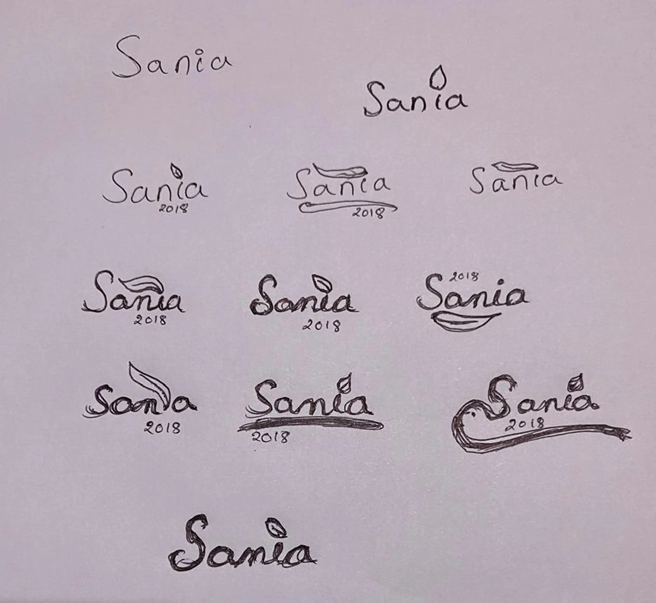
With the meaning established, the next step was translating it visually. A brand built on Natural, Authentic Flavours needed elements that reflected exactly that a leaf and a water droplet were brought in to represent the fresh, natural ingredients behind every Sania product.

Sketching
With the meaning established, the next step was translating it visually. A brand built on Natural, Authentic Flavours needed elements that reflected exactly that a leaf and a water droplet were brought in to represent the fresh, natural ingredients behind every Sania product.
The 23.4° Inclination
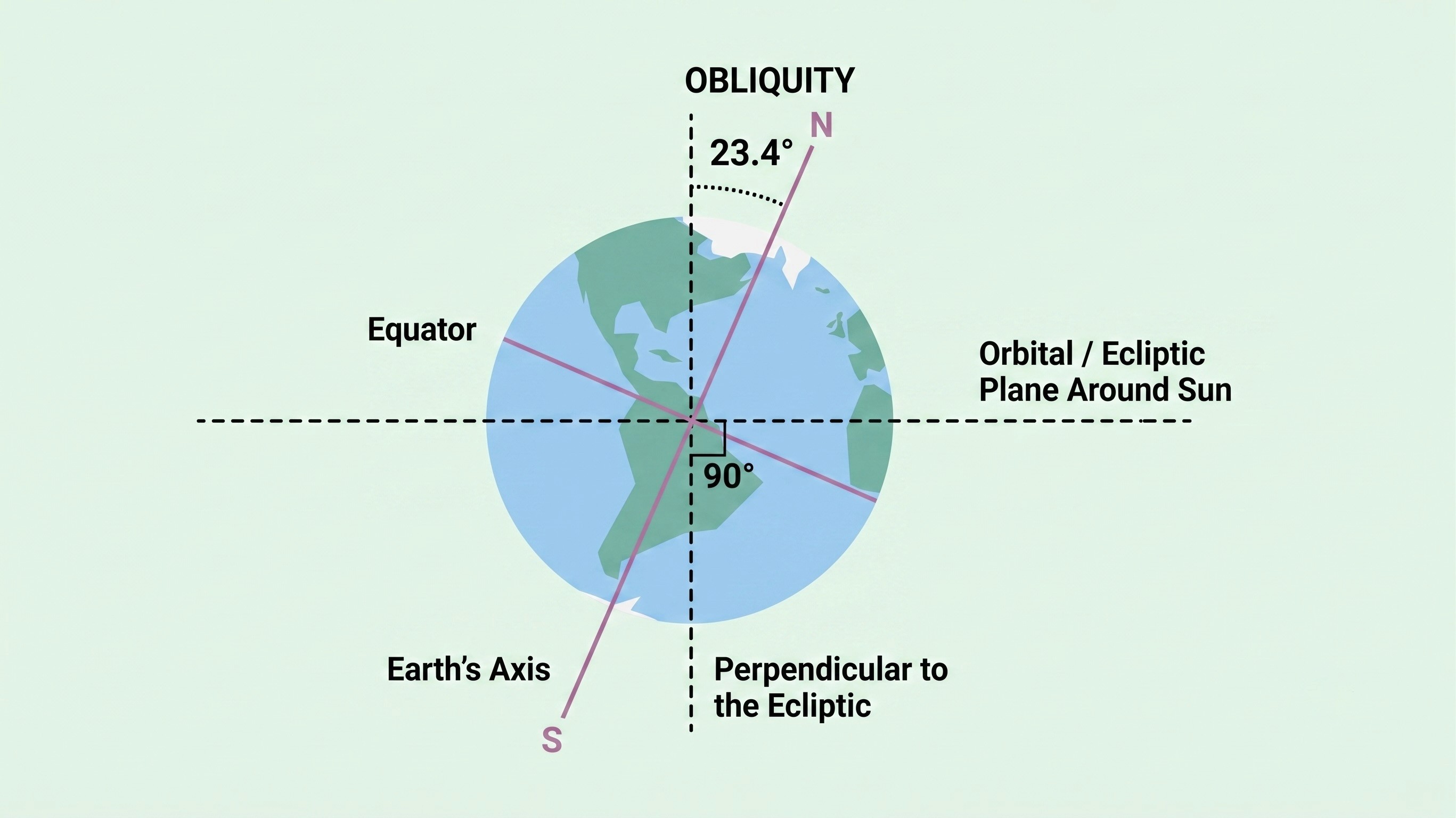
To bring the natural flow into the logo, the typography had to do more than just carry the name it had to feel fluid, organic natural theme without forcing it, giving the logo a flow that feels genuine rather than designed.
Final Logo Design
The logo sits at exactly 23.4 degrees the same angle as the Earth's axial tilt. That tilt is what creates seasons, and seasons are what drive the growth and cultivation of natural ingredients. For a brand rooted in authentic, natural flavours, this wasn't a decorative choice. It was a deliberate way of saying Sania is connected to the natural world at its most fundamental level.

Packaging Design
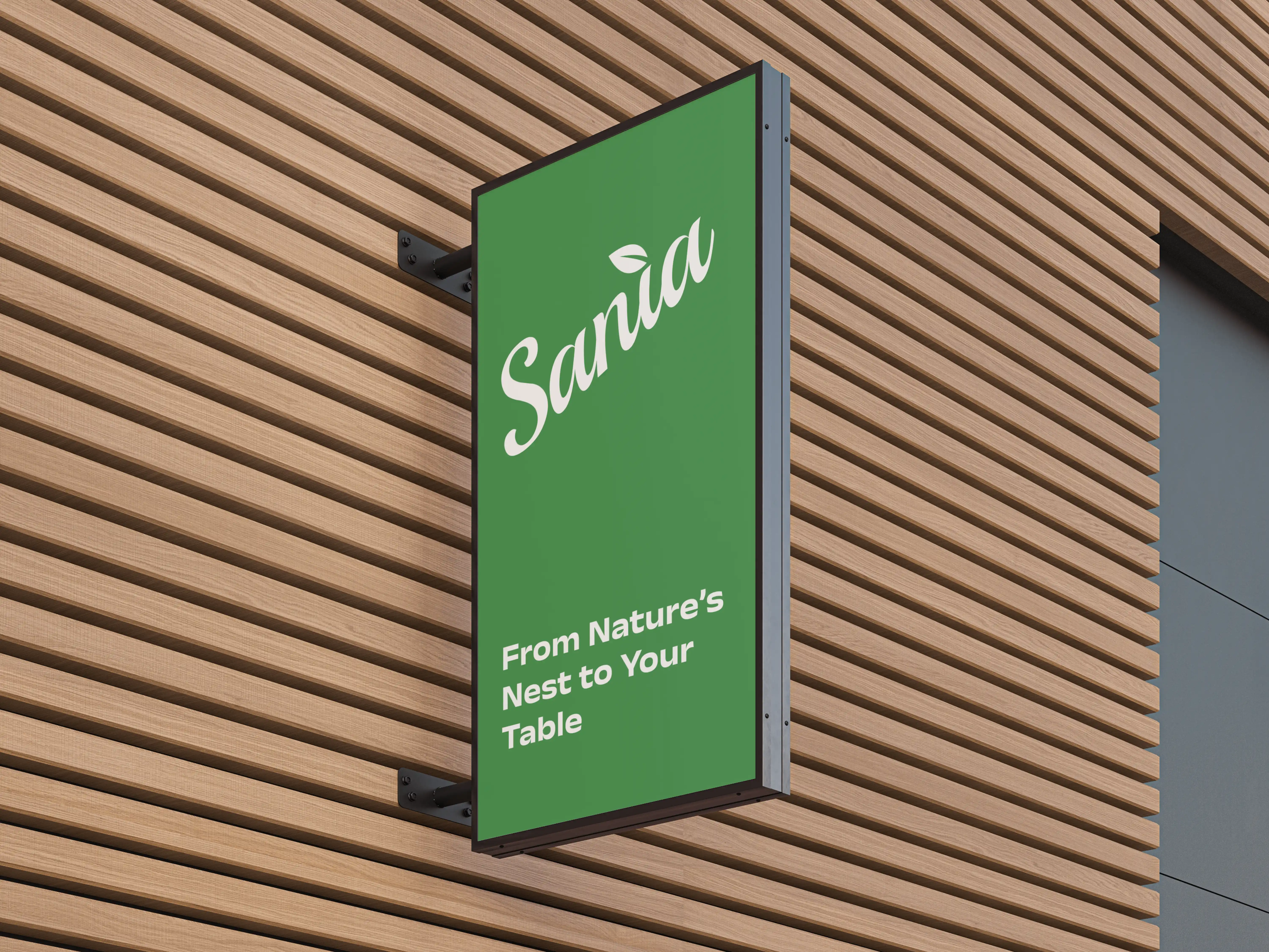
A logo with a name, a meaning, a symbol, and a reason behind every decision built to give Sania a presence in the market that their previous identity never could.
Bottle Design
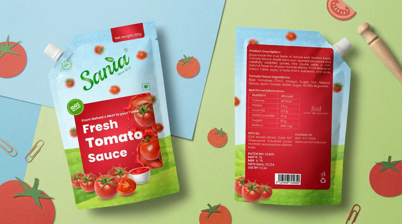
With the Sania brand identity established, the next step was translating it into packaging for one of their core products tomato sauce. The packaging was designed across three formats: Bottle, Sachet, and Pouch to suit different consumption needs and price points, while staying true to the same visual language developed during the logo work.
Each format carries the identity consistently, but the packaging itself was built to reflect what the logo stands for the Authentic, Natural quality of the product. Every design choice, from colour to layout, was made to keep that sense of freshness and authenticity visible on the shelf, regardless of format.

Crafting the Identity
The glass bottle uses a wraparound label with the Sania logo, "100% Natural" badge, and the "Fresh Tomato Sauce" name in bold on a red panel, paired with fresh tomato imagery. Nutritional and product details are included on the extended label, making it retail-ready.
Branding
Sania
Sania
From a name to a full brand system. Sania's identity was built to feel fresh, natural, and unmistakably theirs.
From a name to a full brand system. Sania's identity was built to feel fresh, natural, and unmistakably theirs.
Year
2025
Year
2025
Year
2025
Client
Sania
Client
Sania
Client
Sania
Industry
Food Industry
Industry
Food Industry
Industry
Food Industry
Project Duration
4 weeks
Project Duration
4 weeks
Project Duration
4 weeks
Intro
Sania is an Indian food and beverage brand delivering authentic, natural products like juices, tomato sauce, squash, and more. When they came in, their existing logo was nothing more than plain typography with no meaning, no structure, and nothing that could hold its own in a competitive market. The brief was clear, build a brand identity from scratch that reflects who they are and what they stand for.
Objective
To design a complete brand identity for Sania that goes beyond a logo one that carries meaning, communicates naturalness and authenticity, and positions the brand confidently in the market.
Challenge
The hardest part wasn't the design it was finding the meaning behind the name. Sania is a family member's name with no direct connection to the product range. When that came up, it was a dead end. No obvious visual direction, no natural link to juices or sauces or anything on the shelf. It took deep research to uncover that in Hebrew, Sania means "Gift of God" something precious and valuable. That one finding changed everything and gave the entire identity a foundation to build on.
Objective
With the meaning established, the next step was translating it visually. A brand built on Natural, Authentic Flavours needed elements that reflected exactly that a leaf and a water droplet were brought in to represent the fresh, natural ingredients behind every Sania product.
Sketching
With the meaning established, the next step was translating it visually. A brand built on Natural, Authentic Flavours needed elements that reflected exactly that a leaf and a water droplet were brought in to represent the fresh, natural ingredients behind every Sania product.
The 23.4° Inclination
To bring the natural flow into the logo, the typography had to do more than just carry the name it had to feel fluid, organic natural theme without forcing it, giving the logo a flow that feels genuine rather than designed.
Final Logo Design
The logo sits at exactly 23.4 degrees the same angle as the Earth's axial tilt. That tilt is what creates seasons, and seasons are what drive the growth and cultivation of natural ingredients. For a brand rooted in authentic, natural flavours, this wasn't a decorative choice. It was a deliberate way of saying Sania is connected to the natural world at its most fundamental level.
Packaging Design
A logo with a name, a meaning, a symbol, and a reason behind every decision built to give Sania a presence in the market that their previous identity never could.
Bottle Design
With the Sania brand identity established, the next step was translating it into packaging for one of their core products tomato sauce. The packaging was designed across three formats: Bottle, Sachet, and Pouch to suit different consumption needs and price points, while staying true to the same visual language developed during the logo work.
Each format carries the identity consistently, but the packaging itself was built to reflect what the logo stands for the Authentic, Natural quality of the product. Every design choice, from colour to layout, was made to keep that sense of freshness and authenticity visible on the shelf, regardless of format.
Crafting the Identity
The glass bottle uses a wraparound label with the Sania logo, "100% Natural" badge, and the "Fresh Tomato Sauce" name in bold on a red panel, paired with fresh tomato imagery. Nutritional and product details are included on the extended label, making it retail-ready.
Branding
Sania
Sania
From a name to a full brand system. Sania's identity was built to feel fresh, natural, and unmistakably theirs.
From a name to a full brand system. Sania's identity was built to feel fresh, natural, and unmistakably theirs.
Year
2025
Year
2025
Year
2025
Client
Sania
Client
Sania
Client
Sania
Industry
Food Industry
Industry
Food Industry
Industry
Food Industry
Project Duration
4 weeks
Project Duration
4 weeks
Project Duration
4 weeks
Intro
Sania is an Indian food and beverage brand delivering authentic, natural products like juices, tomato sauce, squash, and more. When they came in, their existing logo was nothing more than plain typography with no meaning, no structure, and nothing that could hold its own in a competitive market. The brief was clear, build a brand identity from scratch that reflects who they are and what they stand for.
Objective
To design a complete brand identity for Sania that goes beyond a logo one that carries meaning, communicates naturalness and authenticity, and positions the brand confidently in the market.
Challenge
The hardest part wasn't the design it was finding the meaning behind the name. Sania is a family member's name with no direct connection to the product range. When that came up, it was a dead end. No obvious visual direction, no natural link to juices or sauces or anything on the shelf. It took deep research to uncover that in Hebrew, Sania means "Gift of God" something precious and valuable. That one finding changed everything and gave the entire identity a foundation to build on.
Objective
With the meaning established, the next step was translating it visually. A brand built on Natural, Authentic Flavours needed elements that reflected exactly that a leaf and a water droplet were brought in to represent the fresh, natural ingredients behind every Sania product.
Sketching
With the meaning established, the next step was translating it visually. A brand built on Natural, Authentic Flavours needed elements that reflected exactly that a leaf and a water droplet were brought in to represent the fresh, natural ingredients behind every Sania product.
The 23.4° Inclination
To bring the natural flow into the logo, the typography had to do more than just carry the name it had to feel fluid, organic natural theme without forcing it, giving the logo a flow that feels genuine rather than designed.
Final Logo Design
The logo sits at exactly 23.4 degrees the same angle as the Earth's axial tilt. That tilt is what creates seasons, and seasons are what drive the growth and cultivation of natural ingredients. For a brand rooted in authentic, natural flavours, this wasn't a decorative choice. It was a deliberate way of saying Sania is connected to the natural world at its most fundamental level.
Packaging Design
A logo with a name, a meaning, a symbol, and a reason behind every decision built to give Sania a presence in the market that their previous identity never could.
Bottle Design
With the Sania brand identity established, the next step was translating it into packaging for one of their core products tomato sauce. The packaging was designed across three formats: Bottle, Sachet, and Pouch to suit different consumption needs and price points, while staying true to the same visual language developed during the logo work.
Each format carries the identity consistently, but the packaging itself was built to reflect what the logo stands for the Authentic, Natural quality of the product. Every design choice, from colour to layout, was made to keep that sense of freshness and authenticity visible on the shelf, regardless of format.
Crafting the Identity
The glass bottle uses a wraparound label with the Sania logo, "100% Natural" badge, and the "Fresh Tomato Sauce" name in bold on a red panel, paired with fresh tomato imagery. Nutritional and product details are included on the extended label, making it retail-ready.