Branding
Sania
Sania
From a name to a full brand system. Sania's identity was built to feel fresh, natural, and unmistakably theirs.
From a name to a full brand system. Sania's identity was built to feel fresh, natural, and unmistakably theirs.
Year
2025
Year
2025
Year
2025
Industry
Food Industry
Industry
Food Industry
Industry
Food Industry
Intro
Sania is an Indian food and beverage brand delivering authentic, natural products like juices, tomato sauce, squash, and more. When they came in, their existing logo was nothing more than plain typography with no meaning, no structure, and nothing that could hold its own in a competitive market. The brief was clear, build a brand identity from scratch that reflects who they are and what they stand for.
Sketching
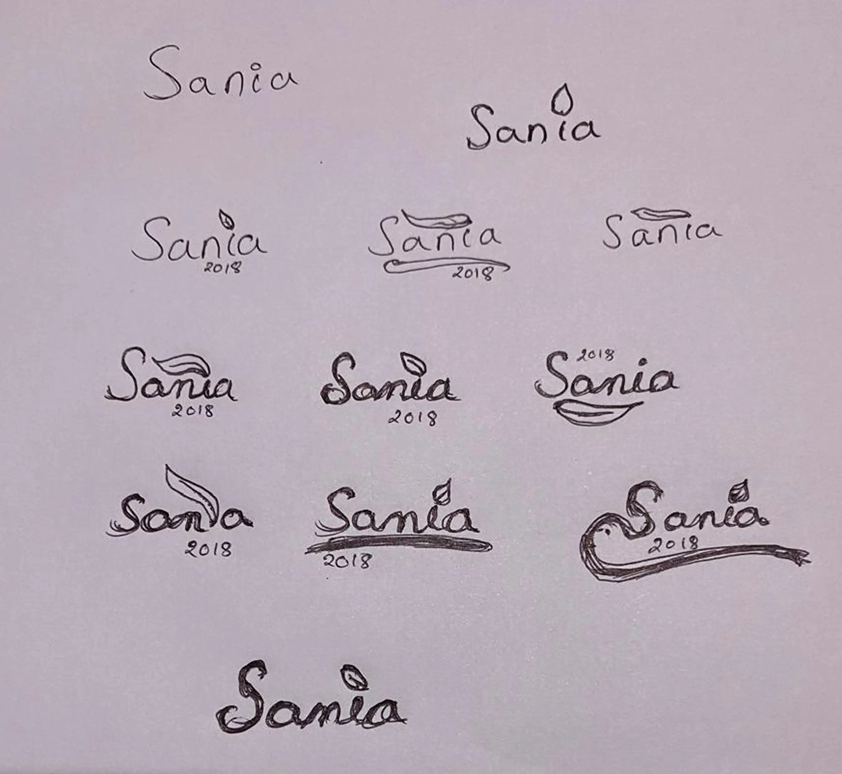
To bring the natural flow into the logo, the typography had to do more than just carry the name it had to feel fluid, organic natural theme without forcing it, giving the logo a flow that feels genuine rather than designed.
The 23.4° Inclination
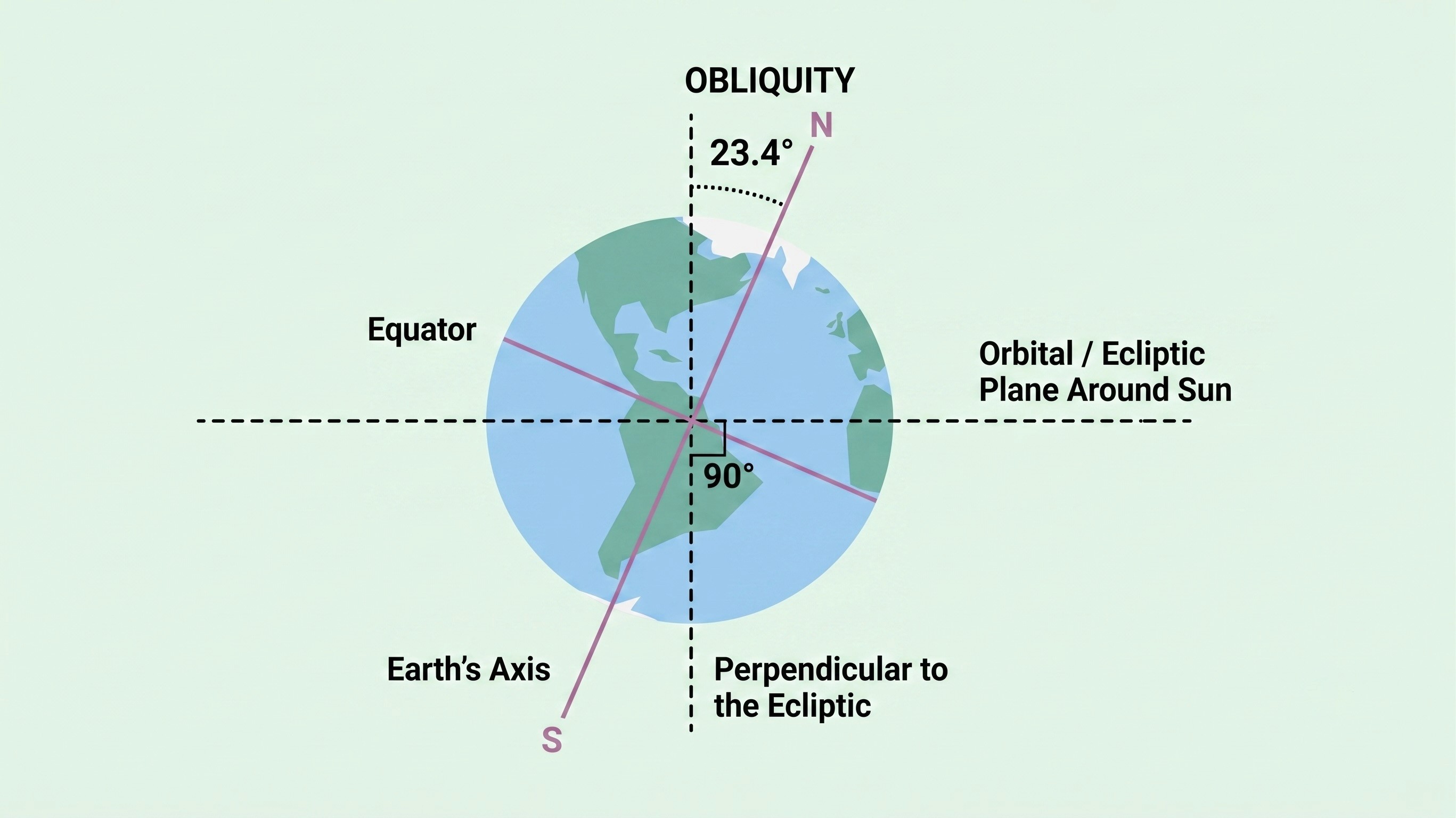
The logo sits at exactly 23.4 degrees the same angle as the Earth's axial tilt. That tilt is what creates seasons, and seasons are what drive the growth and cultivation of natural ingredients. For a brand rooted in authentic, natural flavours, this wasn't a decorative choice. It was a deliberate way of saying Sania is connected to the natural world at its most fundamental level.
Final Logo Design
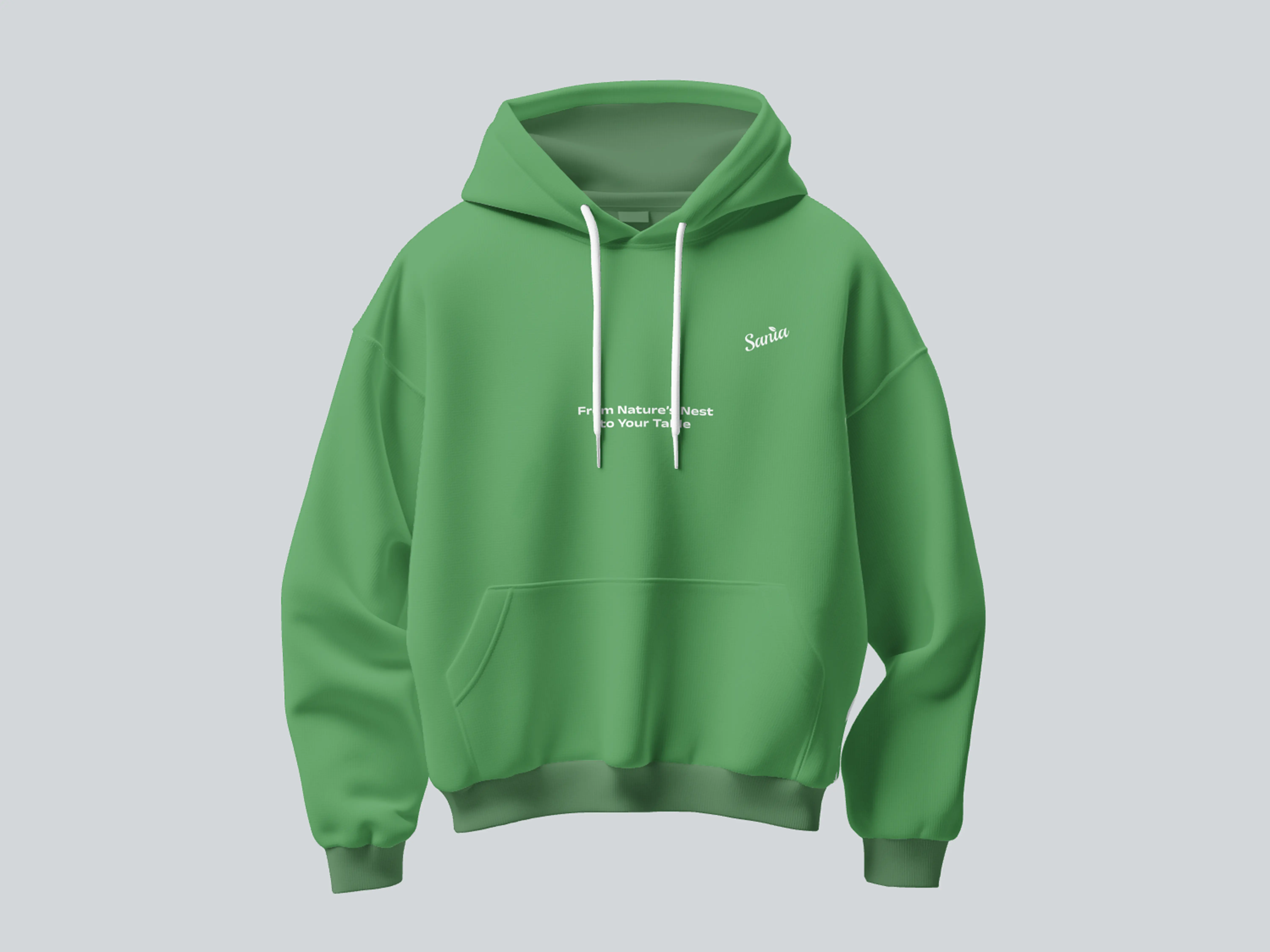
A logo with a name, a meaning, a symbol, and a reason behind every decision built to give Sania a presence in the market that their previous identity never could.

Bottle Design
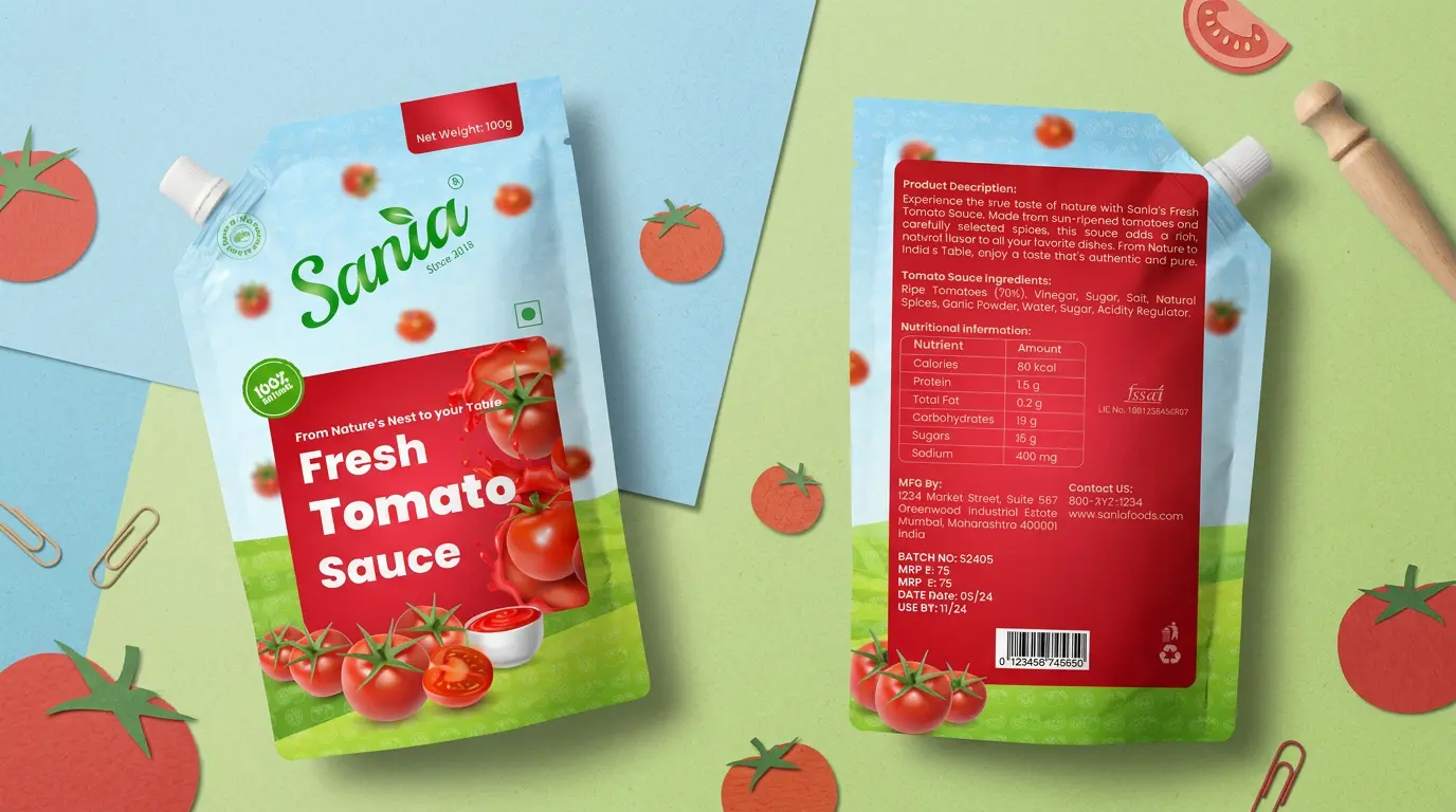
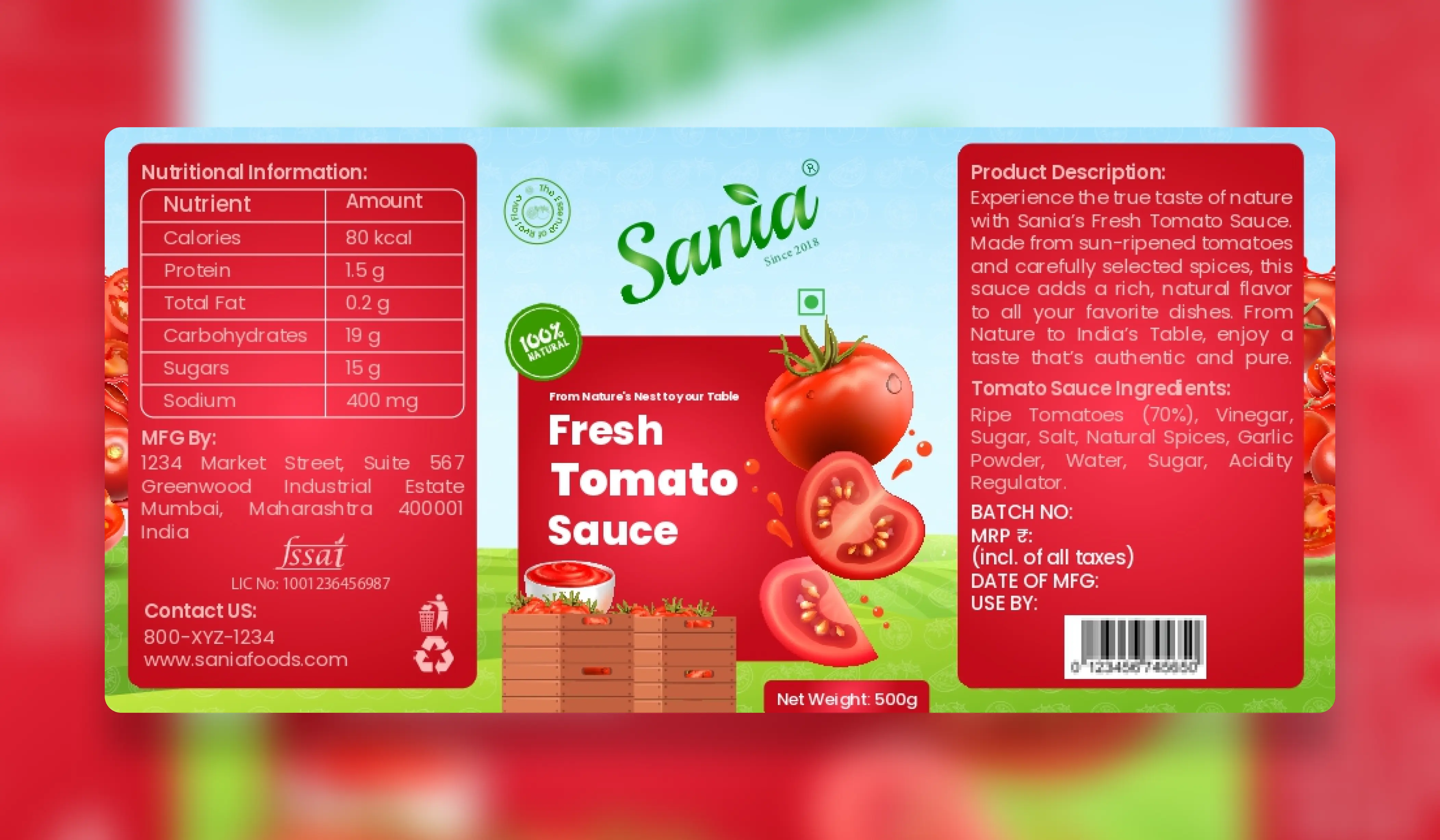
The glass bottle uses a wraparound label with the Sania logo, "100% Natural" badge, and the "Fresh Tomato Sauce" name in bold on a red panel, paired with fresh tomato imagery. Nutritional and product details are included on the extended label, making it retail-ready.
Branding
Sania
Sania
From a name to a full brand system. Sania's identity was built to feel fresh, natural, and unmistakably theirs.
From a name to a full brand system. Sania's identity was built to feel fresh, natural, and unmistakably theirs.
Year
2025
Year
2025
Year
2025
Industry
Food Industry
Industry
Food Industry
Industry
Food Industry
Intro
Sania is an Indian food and beverage brand delivering authentic, natural products like juices, tomato sauce, squash, and more. When they came in, their existing logo was nothing more than plain typography with no meaning, no structure, and nothing that could hold its own in a competitive market. The brief was clear, build a brand identity from scratch that reflects who they are and what they stand for.
Sketching
To bring the natural flow into the logo, the typography had to do more than just carry the name it had to feel fluid, organic natural theme without forcing it, giving the logo a flow that feels genuine rather than designed.
The 23.4° Inclination
The logo sits at exactly 23.4 degrees the same angle as the Earth's axial tilt. That tilt is what creates seasons, and seasons are what drive the growth and cultivation of natural ingredients. For a brand rooted in authentic, natural flavours, this wasn't a decorative choice. It was a deliberate way of saying Sania is connected to the natural world at its most fundamental level.
Final Logo Design
A logo with a name, a meaning, a symbol, and a reason behind every decision built to give Sania a presence in the market that their previous identity never could.
Bottle Design
The glass bottle uses a wraparound label with the Sania logo, "100% Natural" badge, and the "Fresh Tomato Sauce" name in bold on a red panel, paired with fresh tomato imagery. Nutritional and product details are included on the extended label, making it retail-ready.
Branding
Sania
Sania
From a name to a full brand system. Sania's identity was built to feel fresh, natural, and unmistakably theirs.
From a name to a full brand system. Sania's identity was built to feel fresh, natural, and unmistakably theirs.
Year
2025
Year
2025
Year
2025
Industry
Food Industry
Industry
Food Industry
Industry
Food Industry
Intro
Sania is an Indian food and beverage brand delivering authentic, natural products like juices, tomato sauce, squash, and more. When they came in, their existing logo was nothing more than plain typography with no meaning, no structure, and nothing that could hold its own in a competitive market. The brief was clear, build a brand identity from scratch that reflects who they are and what they stand for.
Sketching
To bring the natural flow into the logo, the typography had to do more than just carry the name it had to feel fluid, organic natural theme without forcing it, giving the logo a flow that feels genuine rather than designed.
The 23.4° Inclination
The logo sits at exactly 23.4 degrees the same angle as the Earth's axial tilt. That tilt is what creates seasons, and seasons are what drive the growth and cultivation of natural ingredients. For a brand rooted in authentic, natural flavours, this wasn't a decorative choice. It was a deliberate way of saying Sania is connected to the natural world at its most fundamental level.
Final Logo Design
A logo with a name, a meaning, a symbol, and a reason behind every decision built to give Sania a presence in the market that their previous identity never could.
Bottle Design
The glass bottle uses a wraparound label with the Sania logo, "100% Natural" badge, and the "Fresh Tomato Sauce" name in bold on a red panel, paired with fresh tomato imagery. Nutritional and product details are included on the extended label, making it retail-ready.